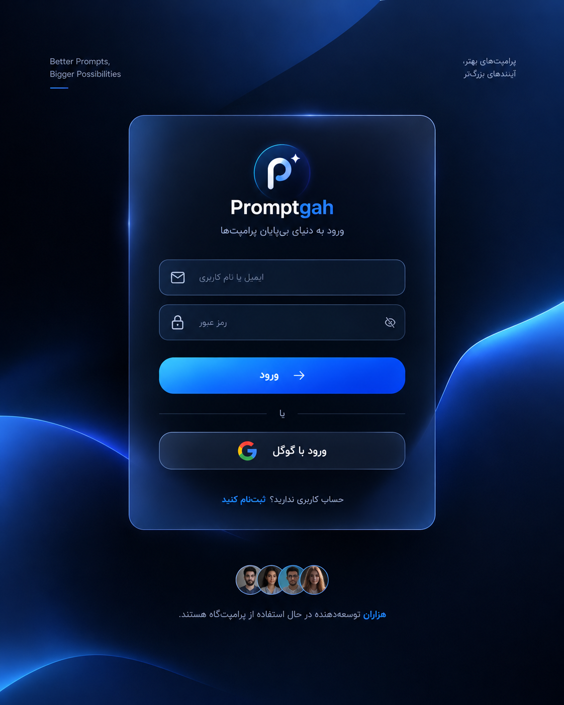
یک کارت ورود با پسزمینه تیره، افکت شیشهای، فیلد ایمیل و رمز عبور و دکمههای ورود ایجاد میکند
متن پرامپت
You are given a task to integrate an existing React component in the codebase
The codebase should support:
- shadcn project structure
- Tailwind CSS
- Typescript
If it doesn't, provide instructions on how to setup project via shadcn CLI, install Tailwind or Typescript.
Determine the default path for components and styles.
If default path for components is not /components/ui, provide instructions on why it's important to create this folder
Copy-paste this component to /components/ui folder:
```tsx
modern-stunning-sign-in.tsx
"use client";
import * as React from "react";
import { useState } from "react";
const SignIn1 = () => {
const [email, setEmail] = React.useState("");
const [password, setPassword] = React.useState("");
const [error, setError] = React.useState("");
const validateEmail = (email: string) => {
return /^[^\s@]+@[^\s@]+\.[^\s@]+$/.test(email);
};
const handleSignIn = () => {
if (!email || !password) {
setError("Please enter both email and password.");
return;
}
if (!validateEmail(email)) {
setError("Please enter a valid email address.");
return;
}
setError("");
alert("Sign in successful! (Demo)");
};
return (
<div className="min-h-screen flex flex-col items-center justify-center bg-[#121212] relative overflow-hidden w-full rounded-xl">
{/* Centered glass card */}
<div className="relative z-10 w-full max-w-sm rounded-3xl bg-gradient-to-r from-[#ffffff10] to-[#121212] backdrop-blur-sm shadow-2xl p-8 flex flex-col items-center">
{/* Logo */}
<div className="flex items-center justify-center w-12 h-12 rounded-full bg-white/20 mb-6 shadow-lg">
<img src="https://cdn.21st.dev/assets/localized/92db5b0ae3b97eefb3308b3ad28645caaaf0a5125369b81c7cb8a8df1a610043.svg" />
</div>
{/* Title */}
<h2 className="text-2xl font-semibold text-white mb-6 text-center">
HextaUI
</h2>
{/* Form */}
<div className="flex flex-col w-full gap-4">
<div className="w-full flex flex-col gap-3">
<input
placeholder="Email"
type="email"
value={email}
className="w-full px-5 py-3 rounded-xl bg-white/10 text-white placeholder-gray-300 text-sm focus:outline-none focus:ring-2 focus:ring-gray-400"
onChange={(e) => setEmail(e.target.value)}
/>
<input
placeholder="Password"
type="password"
value={password}
className="w-full px-5 py-3 rounded-xl bg-white/10 text-white placeholder-gray-300 text-sm focus:outline-none focus:ring-2 focus:ring-gray-400"
onChange={(e) => setPassword(e.target.value)}
/>
{error && (
<div className="text-sm text-red-400 text-left">{error}</div>
)}
</div>
<hr className="opacity-10" />
<div>
<button
onClick={handleSignIn}
className="w-full bg-white/10 text-white font-medium px-5 py-3 rounded-full shadow hover:bg-white/20 transition mb-3 text-sm"
>
Sign in
</button>
{/* Google Sign In */}
<button className="w-full flex items-center justify-center gap-2 bg-gradient-to-b from-[#232526] to-[#2d2e30] rounded-full px-5 py-3 font-medium text-white shadow hover:brightness-110 transition mb-2 text-sm">
<img
src="https://cdn.21st.dev/assets/mirror/38/38146bfd9eff6dbf0d74771f2e625c70d87d3770e0d080dbb6e50db1d5403f46.svg"
alt="Google"
className="w-5 h-5"
/>
Continue with Google
</button>
<div className="w-full text-center mt-2">
<span className="text-xs text-gray-400">
Don't have an account?{" "}
<a
href="#"
className="underline text-white/80 hover:text-white"
>
Sign up, it's free!
</a>
</span>
</div>
</div>
</div>
</div>
{/* User count and avatars */}
<div className="relative z-10 mt-12 flex flex-col items-center text-center">
<p className="text-gray-400 text-sm mb-2">
Join <span className="font-medium text-white">thousands</span> of
developers who are already using HextaUI.
</p>
<div className="flex">
<img
src="https://cdn.21st.dev/assets/mirror/a6/a634d4f02fe5b77804943c1d74b8d70e35ffe26454e0e9af9717432a2c72bfde.jpg"
alt="user"
className="w-8 h-8 rounded-full border-2 border-[#181824] object-cover"
/>
<img
src="https://cdn.21st.dev/assets/mirror/d8/d8dab29a5736d5c2b0084d720d3db02c785560071609be501541922928fdf831.jpg"
alt="user"
className="w-8 h-8 rounded-full border-2 border-[#181824] object-cover"
/>
<img
src="https://cdn.21st.dev/assets/mirror/d1/d1a3e08d4e37d6ee2b7de1db8df87c1dc7acd8ffb004caaf980917de518a60c9.jpg"
alt="user"
className="w-8 h-8 rounded-full border-2 border-[#181824] object-cover"
/>
<img
src="https://cdn.21st.dev/assets/mirror/f0/f07b84f12ef125cbb837a7bd64da401992f5f62bd55fee10d01cd3dcc8abae80.jpg"
alt="user"
className="w-8 h-8 rounded-full border-2 border-[#181824] object-cover"
/>
</div>
</div>
</div>
);
};
export { SignIn1 };
export default SignIn1;
demo.tsx
import { SignIn1 } from "@/components/ui/modern-stunning-sign-in";
function Demo() {
return <SignIn1 />;
}
export { Demo };
export default Demo;
```
Implementation Guidelines
1. Analyze the component structure and identify all required dependencies
2. Review the component's argumens and state
3. Identify any required context providers or hooks and install them
4. Questions to Ask
- What data/props will be passed to this component?
- Are there any specific state management requirements?
- Are there any required assets (images, icons, etc.)?
- What is the expected responsive behavior?
- What is the best place to use this component in the app?
Steps to integrate
0. Copy paste all the code above in the correct directories
1. Install external dependencies
2. Fill image assets with Unsplash stock images you know exist
3. Use lucide-react icons for svgs or logos if component requires themتنظیمات کد
زبان
JavaScript
فریمورک
React
خروجی مورد انتظار
بررسی ساختار پروژه: بررسی میکند پروژه از TypeScript، Tailwind CSS و ساختار shadcn/ui پشتیبانی میکند یا نه؛ اگر نکند، راهاندازی آنها را توضیح میدهد. ساخت کامپوننت: فایل modern-stunning-sign-in.tsx را در مسیر components/ui قرار میدهد. پیادهسازی ظاهر صفحه: یک کارت ورود با پسزمینه تیره، افکت شیشهای، فیلد ایمیل و رمز عبور و دکمههای ورود ایجاد میکند. اعتبارسنجی فرم: خالی نبودن ایمیل و رمز عبور و قالب ایمیل را بررسی میکند و خطا نشان میدهد. اضافه کردن تصاویر: از لوگو، آیکون گوگل و تصاویر آواتار کاربران استفاده میکند. ساخت دمو: یک فایل demo.tsx ایجاد میکند تا بتوان کامپوننت را نمایش داد.
نظرات
نظر خودت را ثبت کن
پرامپتهای مشابه
کدنویسیپرامپت حرفهای برای طراحی و توسعه یک پلتفرم SaaS امن، مقیاسپذیر و آماده Production.
codingGPTClaude
Enterprise SaaS Architect — سیستم جامع ساخت پلتفرم SaaS
۵,۹۰۰,۰۰۰ تومانمشاهده
A powerful AI coding prompt for building secure, scalable, production-ready software.
codingGPTClaude
AI Code Architect — Full-Stack Developer
۱۴۹,۰۰۰ تومانمشاهده
پرامپتی پیشرفته برای طراحی و توسعه SaaSهای مقیاسپذیر با احراز هویت، اشتراک، پرداخت، پنل مدیریت، API و امنیت حرفهای.
codingGPTClaude
AI SaaS Architect — سازنده پلتفرمهای حرفهای
۷۹۰,۰۰۰ تومانمشاهده